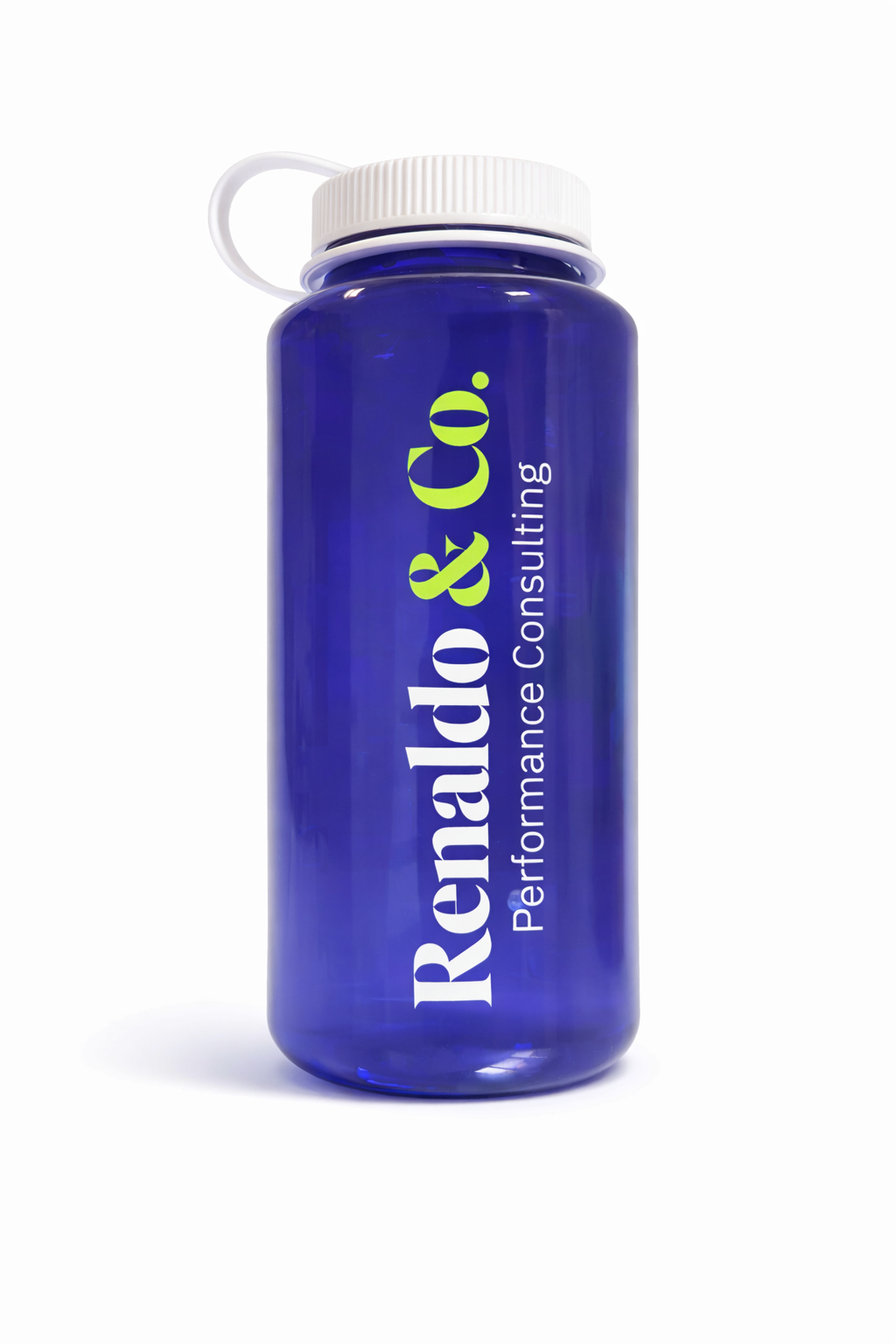
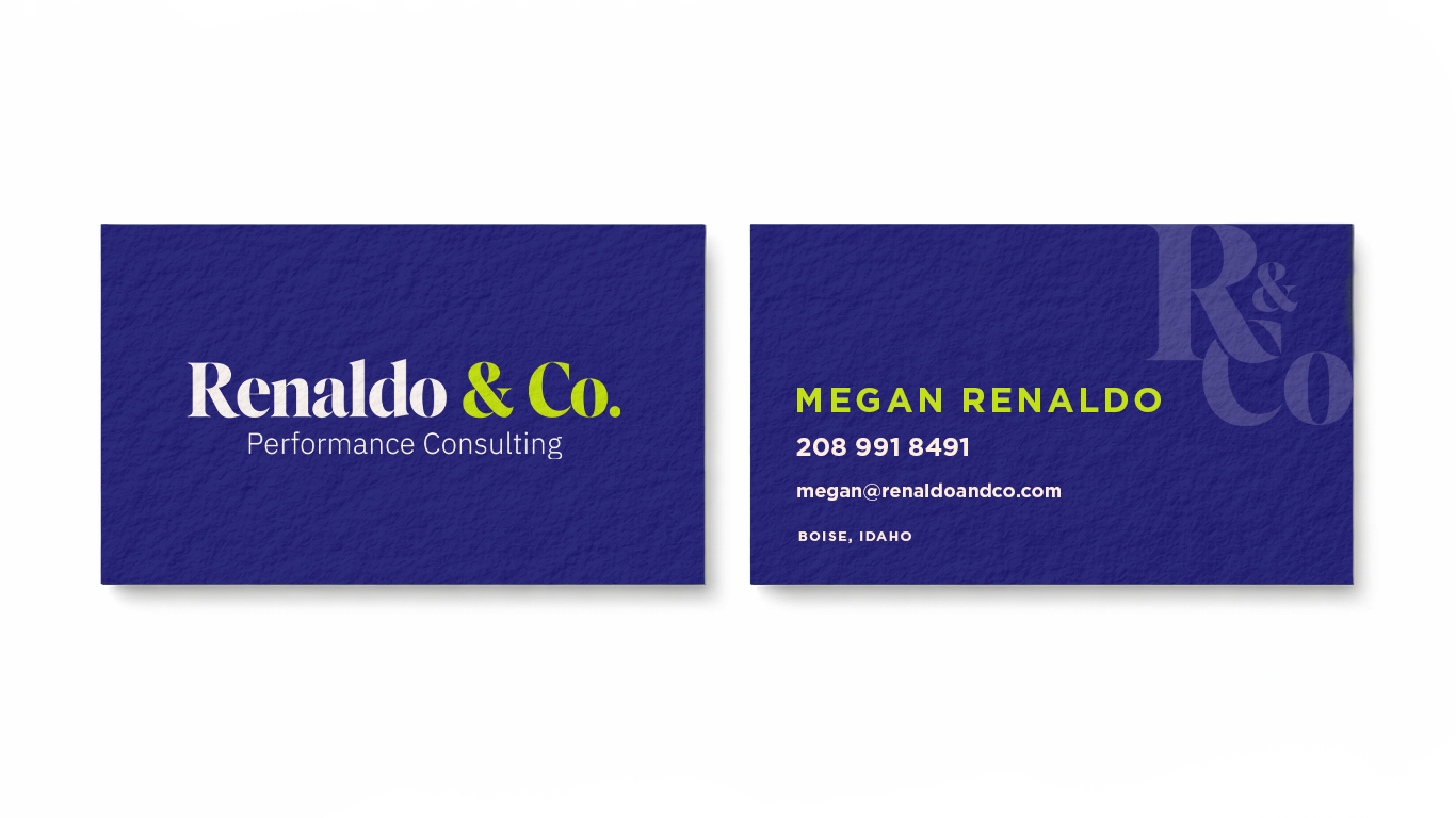


The Renaldo & Co wordmark and mark were designed to reflect the brand’s modern, direct, and no-nonsense approach to leadership. The client wanted something clean, confident, and free of extra fluff, so the typography is bold and straightforward. A brighter navy anchors the identity with an electric green accent that adds energy and growth. The result is a visual system that stands out while communicating exactly what Renaldo & Co delivers: practical guidance and results without the BS.